Color Guide

About Color
Our university's colors are Chicago maroon burnt orange.
Adding a secondary palette increases flexibility for many different communication styles, while creating connections among all of our materials.
Using color appropriately is one of the easiest ways to make sure our materials reflect a cohesive Virginia Tech brand.
Primary and Secondary Palettes
The Virginia Tech color palette has two layers: primary and secondary. Our primary palette will always include Chicago maroon and burnt orange, supplemented by yardline white and Hokie Stone as neutrals. These colors should be present in most marketing and communications materials. The secondary colors should be used as accents or to represent different moods.
Below are the tools and information you will need to make the right design choices and sample color palettes that can be used by sub-brands and programs to create visual distinction while still maintaining the integrity of the university brand.
TIP: When using color builds, always use the color values listed below. They have been adjusted for the best reproduction on screen and in print.
Primary Palette
Secondary Palette
The secondary palette is a mix of colors from vibrants to neutrals. Impact orange should replace the primary burnt orange when used for digital text. Virginia Tech logo files must always be Chicago maroon and burnt orange. This particular shade is darker with higher contrast for web accessibility.
Brand color tool with an extended palette
Shades and tints of brand colors may be used to create variety within the Virginia Tech color palette. Shading or darkening of maroon and orange is permitted but tinting or lightening is not. However, to achieve a translucent look, you may apply a multiply treatment to either color. Shading and tinting are permitted for Hokie Stone, yardline white, and all colors in the secondary color palette, as diagrammed on the following pages. This is for use in design, not to be applied to any mark or logo.
TIP: For digital use, RGB, HEX values, and CSS variables should be used. Special consideration should be given to accessibility whenever possible. When printing, consideration should be given for paper stock, printer type, and printing process. PMS and CMYK values may need to be adjusted to reproduce properly based on these considerations. Download the palettes for Adobe Creative Cloud.
Using Colors
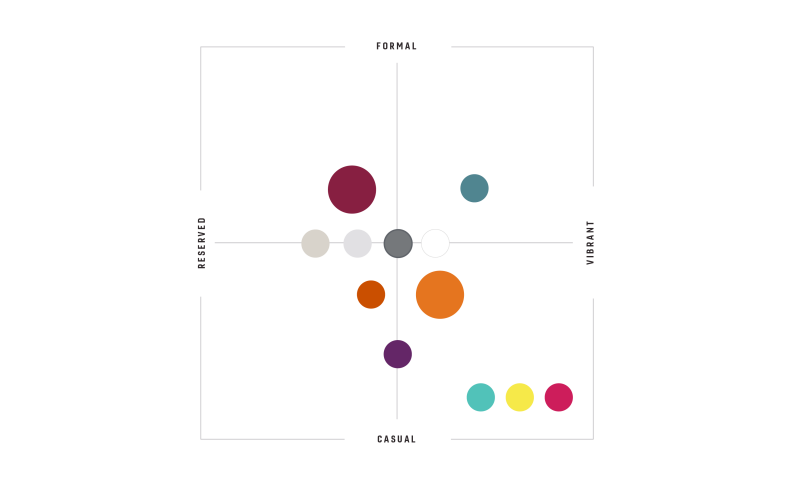
It’s important to maintain a sense of hierarchy when using the Virginia Tech color palette. While our color system is flexible, be careful to exercise restraint. Unique and exciting color palettes can be created using as few as three or four colors. The following pages draw from the entire palette for effective color combinations. For print applications, each sample is different but maintains the character and emotion that characterize Virginia Tech. This isn’t meant to be a precise mathematical system but is intended to give an idea of relative use. It’s also important to note that the primary palette plays a role in each sub-palette, even if it’s a minimal one. This chart is a guide for the mood each color conveys on a communications piece. Colors can range from formal to casual and from reserved to vibrant.
2 dimensional grid with 'reserved' and 'vibrant' on the ends of the x-axis and 'formal' to 'casual' on y-axis with the various fonta places on the plane according to their intended use.