

Design

Jump to a section: Line Work and Texture | Data Visualization | Illustrations | Designing with Photography | Best Practices
Our design elements are a key way to differentiate the Virginia Tech brand. When we use them appropriately, they create energy and depth in a design and form a visual system that is uniquely Virginia Tech’s.
NOTE: When using line work and texture in motion pieces, they should never distract or take attention away from the message and should be used purposefully to support key content.
Detail Lines
Detail lines help guide the user’s eye to important elements of the design and work to balance the composition when needed. They may be used to underline text, create depth, highlight data points, and indicate direction. Detail lines can appear in two different weights.

NOTE: Detail lines should never distract from the focus of the design and message. These lines should be used only to enhance or improve the design and should rarely be used as decoration. Lines should never be thicker than 2 points or pixels; they can be solid or dashed.
Text Anchors
Detail lines help guide the user’s eye to important elements of the design and work to balance the composition when needed. They may be used to underline text, create depth, highlight data points, and indicate direction. Detail lines can appear in two different weights:
Diagonal Text Anchor
The diagonal text anchor can be used either with a single headline or in combination with a headline and body copy. Please follow the proportion guidelines above to maintain consistency.
Corner Text Anchor
The corner text anchor can be used either with a single headline or in combination with a headline and subhead. Please follow the proportion guidelines above to maintain consistency.


TIP: To see these text anchors in action, consult the downloadable Brand Guidelines.
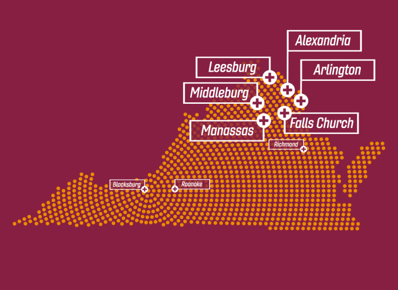
Square Dots and Patterns
Square dots call out tertiary elements, such as page numbers and section types. The square dots can be used as a design elements to call attention to numbers, section types, and more. They can also be used to create texture, balance layout, and give a sense of depth. They can appear in three different sizes, depending on how they are used.
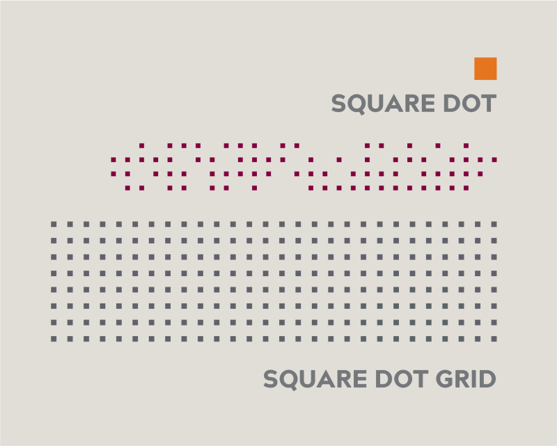
TIP: When using the dot in a line of text, set the dot one square’s width away from the left edge of the text. Microsoft Word has a square bullet that can simply be changed to orange. To see the different ways to use the square dots and patterns, consult the downloadable Brand Guidelines.
Data Visualization
Using visual representations, such as pie charts, bar graphs, and line graphs, is a simple way to illustrate your data. First and foremost, graphs should be easy to understand and should include only essential information. You can achieve this by labeling your data with clear titles, using color coding to differentiate information, and including a color key to differentiate data. For clarity when portraying data, you should also avoid using three-dimensional and gradient graphics.
For web use in the CMS, charts will need to be converted into images with proper descriptions (alt text).
Illustrations
Illustrations play an important supplementary role in the Virginia Tech brand. They provide a great way to make a complex or abstract idea more simple, to evoke emotion, or to express ideas. Illustrations help tell stories that are hard to tell with photography and should be thoughtful, conceptual, and not purely decorative.
University trademarks, including the HokieBird, may not be illustrated (with the exception of the Daily Doodles, which are created by the university illustrator). Externally owned trademarks may not be illustrated.
Illustrations and all artwork, including AI-generated art, must be approved by the appropriate lead college or division communication director or the director of Brand Creative before use.
Crediting illustrations
All illustrations and original artwork should be credited to the artist following university style guidelines: “Illustration by...” Artwork that is assisted by or created in its entirety by AI, must be credited as such: “Virginia Tech photo(s) altered with AI.” or “Illustration using AI by [name] for Virginia Tech.” All uses of AI-generated imagery must be approved by the appropriate lead college or division communication director or the director of Brand Creative before use.


NOTE: Illustrations must be created by professional illustrators, and all artwork must be approved by lead college or division communication directors or the Director of Brand Creative.
Designing with Photography
Photography combined with design can create an engaging and functional composition.
Photographic Containers
Box knockouts are used over the grid element or photographs. The purpose of the knockout is to draw attention to the copy and improve legibility over a busy background. These can be used with body copy, titles, captions, and callouts. Two styles of photographic containers can be used: the more traditional rectangular photo collage, which is recommended for less experienced designers, or the angled treatment, which should be executed by more experienced designers. The angled version should be used for less formal communications. The angle should always be 45 degrees.
Best Practices
Our visual brand creates a look and feel that is consistent and easy to recognize as Virginia Tech, but with enough flexibility for individual programs, schools, and organizations to maintain distinct identities. When done properly, you will see a unique visual language and core brand alignment. One way to think about striking this balance is with an 80/20 ratio.
80%
Visually, up to 80 percent of a single communication can be tailored to the specific school, program, or organization. This can be achieved in many ways, including the use of secondary colors, custom photography, and graphic elements.
20%
For any single communication, at least 20 percent of its design should contain consistent master brand elements which includes primary color palette, brand typefaces, and graphic elements.
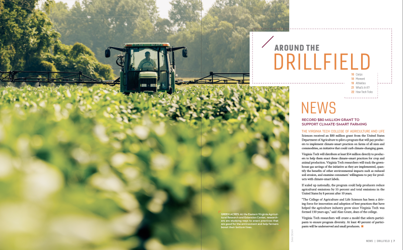
This example combines photography with a clean, simple type for a compelling full-bleed opening. The type should always work with the photo and be placed where it will be legible.
Elements used
- Color: Chicago maroon, burnt orange, and yardline white
- Typography: Gineso Condensed
- Photography: In the Moment, Sense of Place
- Design Elements: Knockout box
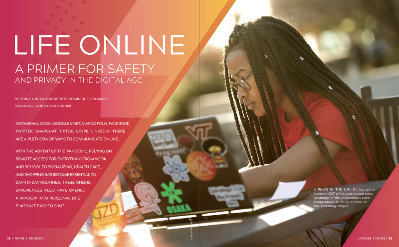
This example shows how to create a focused spread using the angled photo container and other graphic elements.

Elements used
- Color: Chicago maroon and burnt orange
- Typography: Acherus Grotesque
- Photography: Portrait
- Design Elements: Detail lines, diagonal photographic container, and an overlay of color
Elements used
- Color: Chicago maroon, burnt orange, yardline white, and Hokie Stone
- Typography: Acherus Grotesque and Gineso Condensed
- Design Elements: Illustration, detail lines, and square dots
This spread uses a photo collage, illustration, secondary colors, and type to tell a story. When using multiple elements together, it’s important to maintain enough clear white space to express the sophistication of the brand. When using a photo collage, a combination of photographic styles is preferred.

Elements used
- Color: Chicago maroon, vibrant turquoise, boundless pink, sustainable teal
- Typography: Crimson Text
- Photography: In the Moment, Sense of Place, and Detail
- Design Elements: Illustration using an overlay of color and textured photos
Ads must always have a clear message and either include the university logo or the appropriate lockup logo.

TIP: Visit the Downloads page for all brand fonts, design elements, and other resources available for download.