

Type

When it’s used thoughtfully, typography becomes a powerful brand tool that can add visual meaning to what is communicated. Virginia Tech’s typography communicates clearly and cleanly and is flexible for a wide range of uses.
About Type
There are four font families that make the Virginia Tech type system flexible: Archerus Grotesque, Crimson Text, Gineso, and Rubik. Each font family plays a particular role in our visual language, outlined below.
Keep in mind that although there are guidelines for each typeface, individual communications and cases ultimately drive how type is used to ensure legibility. Legibility should always be the primary consideration in selecting type for any design.
Primary Typefaces
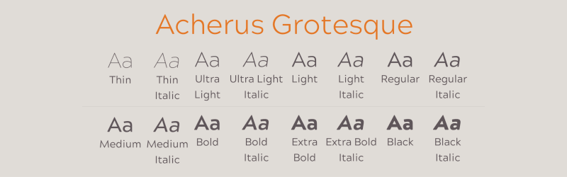
Acherus Grotesque
Acherus Grotesque is the primary type family for the Virginia Tech brand. It has 14 styles and is based on geometric forms. Acherus Grotesque should be used in most cases for text, headlines, sub-headlines, quotes, and callouts.
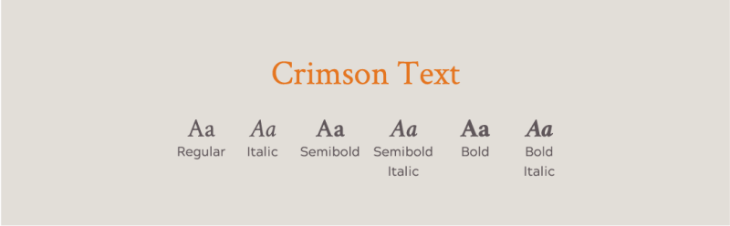
Crimson Text
Crimson Text is reserved primarily for body copy and where the most formal mood needs to be expressed. Crimson Text is inspired by classical, old-style typefaces of the late Renaissance, a period of elegant, beautiful, and high readable type designs. Crimson Text has aesthetic and functional qualities that make text highly readable, with excellent flexibility and typographic control, whether for lengthy text or display settings. It is a Google font, which makes it easy to load for web and easy to install on desktop.
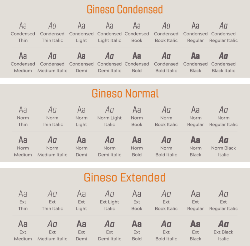
Gineso
Gineso has multiple uses within the Virginia Tech brand, from being used for headlines to callouts. These condensed forms look great on their own or when any of Gineso’s 48 different weights and matching italics are combined with other typefaces.

Rubik
Rubik is a sans serif font family designed by Hubert & Fischer as part of the Chrome Cube Lab project. The design features stout proportions with rounded corners and low stroke contrast. It conveys bold confidence with a human spirit. Rubik can be similarily used in cases like Acherus Grotesque.
Arial
When brand fonts are not available, Arial may be used as an appropriate substitute.
TIP: For internal use, fonts must be downloaded from the Virginia Tech Brand Center. Contact your IT department for help.
NOTE: These have been vetted for accessibility. Best practices for ADA accessibility include: use a sans serif font, keep the same font throughout the document, font size on screen should be 24 points or greater, no more than three different font sizes per slide, and text should not overlap anything. Gineso is a narrow and compact font that works well when space is a concern, however, it can be difficult to read if it is too small and the weight is too light. It is not recommended for large blocks of body copy. Rubik and Acherus should not be used together since the two fonts are similar. When brand fonts are not available, Arial may be used as an appropriate substitute.
Using Type
Consider readers and their distance from the text when determining which font is best to use. The way we use type is crucial to making our designs look thoughtful and professional. Use these tips to make sure our typography is consistent.
Leading
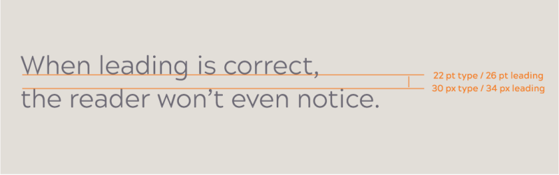
Line spacing, called leading, is critical to setting a professional-looking type that is easy to read. Leading should be set tight, but not so tight that it appears cramped. The Acherus Grotesque family generally looks best with the leading set slightly loose.
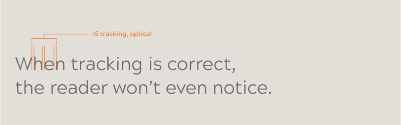
Tracking
Correct letter spacing, called tracking, is needed to make the type easy to read. The Acherus Grotesque family should always be tracked slightly tighter than the default setting, and Gineso condensed should be tracked slightly wider. Optical kerning should be used when it’s available.
Which font should you use?
To help determine which fonts work best, you should always think about the intended usage and audience of your communication. The traits listed on the grid below serve as a guiding framework.
2 dimensional grid with 'reserved' and 'vibrant' on the ends of the x-axis and 'formal' to 'casual' on y-axis with the various fonta places on the plane according to their intended use.

TIP: Visit the Downloads page for all brand fonts, design elements, and other resources available for download.